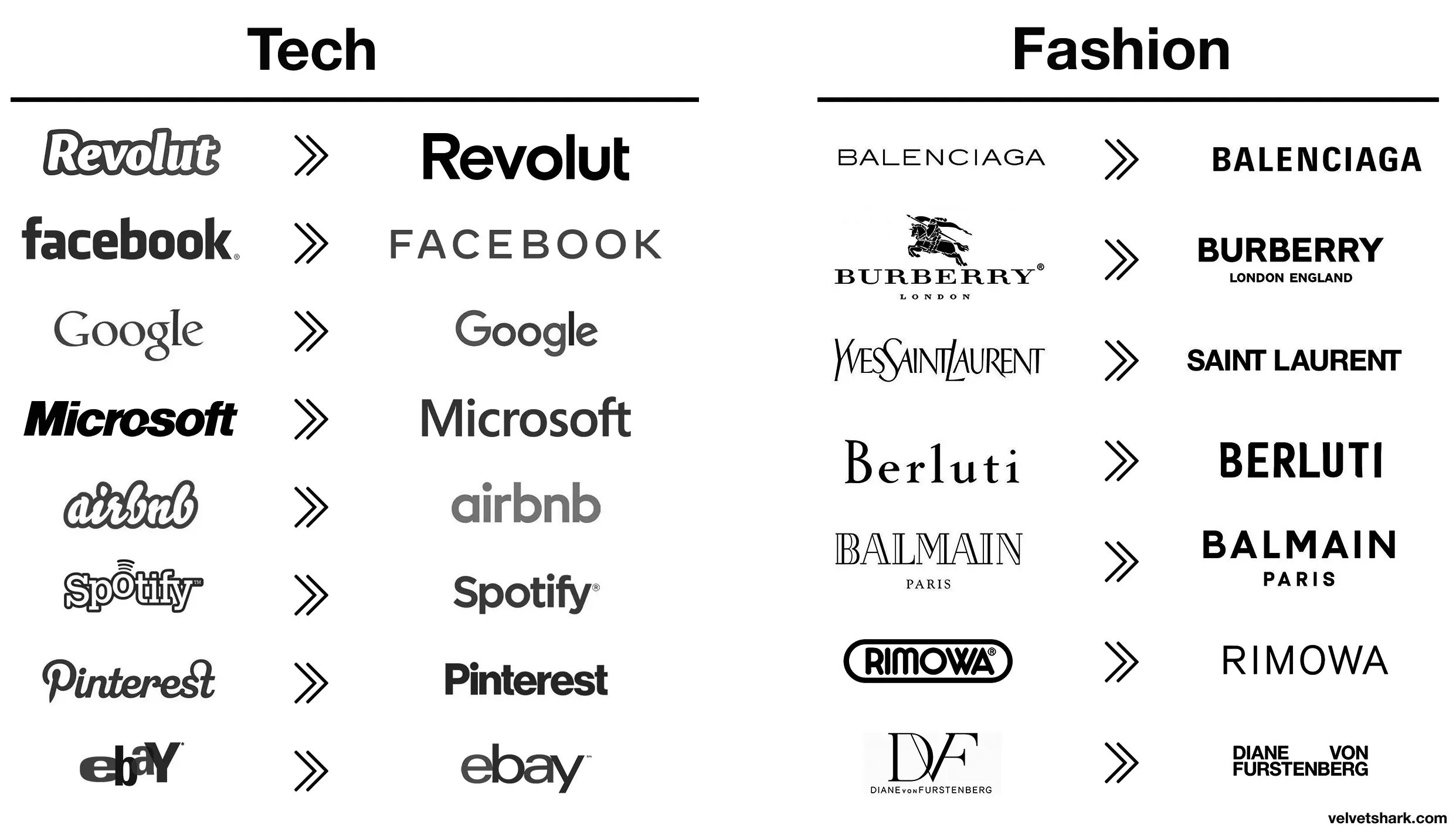
A design consultant probably sent Jaguar a six-figure bill for this new logo, you know.
>New logo is soulless slop
Every single company
My favorite shit logo redesign is
KИ
I can’t believe anyone thought that was a good logo…
the secret is that all logos are soulless slop. you just become attached to the old ones due to familiarity. when that familiarity is removed, you see it for what it really is.
Some have more visual distinctiveness than this new minimalist shit
Soon there will be no color, no originality.
Just a single font to use everything will be homogeneous and consolidated. Minimal, inoffensive and focused grouped to appeal to everyone and also no one.
Movies, music, games, brands.
“We’re a tech company now!” logo
Those old fashion logos are actually sick. Concerning that an industry that sells style would make these their logos.
Except eBay, that was always trash.
Their business is literally selling people’s trash so it’s amusingly appropriate lmao
All these minimalist labels save .0005¢ every time they’re printed, probably even more on promo booths, banners, and the like.
Aaaah then indeed that makes sense (and this is not ironic).
Oh, I wasn’t being entirely serious, though there is an element of truth to it. It probably is a measurable cost savings over the scale of the business.
I still think these unremarkable corporate logos are boring AF. Just makes them visually soulless along with just being corporate soulless.
Changing things for sake of changing things. Like Microsoft with every moronic “update”.
I love how the new logo could be literally done in less than a minute on fucking microsoft office. They didn’t even bother with a cool looking font, just generic curvy shit
Top looks like it belongs on a nice sports car.
Bottom looks like you can find it on a new Multipla.
I would have failed every design class I took in college if I submitted that. Why such wide kerning? Why lower case but upper G? Why so round? Why so completely unreadable at a distance because of micro serifs? There isn’t one good design element in this.
It doesn’t say “car” at all either; no elegance or prestige. The old logo was sexy. New one looks like a logo for bottled water or something.
Edit: it’s like going from James Bond to
Austin PowersInspector GadgetAustin Powers has style. Crazy 60s style but style.


I fucking hate this minimalist design trend more than it is probably reasonable to hate an aesthetic. It’s got the personality of unfinished drywall.
What are they selling now 🙄
Cheap vapes and gucchi knock offs apparently.
/uj Technically this is their new logo:

J a G U a r is just their new typeface (I think that’s the name?); and apparently/allegedly is to make the pronunciation closer to UK English, rather than American.
Either way, though - it’s still…
/j
…pReTtY fArKiN’ sToOoPiD.
You spell stoopid with three O"s. Maybe your the stoopid,
Yeah that’s pretty dummb
You’re all making fun of it but this new style did exactly what it intended to do. Everyone is talking about them now.
Yeah, for a whole 2 hours, until everyone moves on to bitch about the next thing and then Jaguar are stuck with the shitty new logo no-one recognises for long after that.
Why would no one recognize it? Hardly the first time they’ve changed their logo.
But it’s the first time they’ve made a change as drastic as this. I can recognise any Jaguar car out there even if I know fuck all about their cars because I can see the jaguar design on the car.
Now people will have to squint to make out the word JAGUAR in that shitty font? Bad move.
It’s not the first time they’ve made a “drastic” change.
As a matter of. They’ve had a logo similar to this before in the 50’s. With just the word “Jaguar”.
You have the world’s combined knowledge at your fingertips. And you choose to be ignorant and blur out something so stupid as “But it’s the first time they’ve made a change as drastic as this.”
Fair enough. I just don’t care enough about Jaguar to look this shit up tbh
If only they sold stuff that the people talking about it could afford in the first place, maybe that’d boost their sales.
First step is increasing brand recognition. No one will buy if they don’t know you exist.
A brand that has been known for nothing but luxury sports cars for decades, including by people who don’t even follow car culture, is hardly one that would need to increase brand recognition. I’d expect that from a new company, not one with nearly 80 years operating under the same name
Did you know. That every single year. Millions of people are born that has never heard of Jaguar. Because why would they?
Last time I ever heard someone talk about Jaguar was 20 years ago when they sold their f1 team.
Prior to that. I have not given them as much as a single thought. So yes. Them changing their logo certainly did what it was supposed to do. Get people to talk about Jaguar.
Somewhere in Jaguar HQ, a marketing firm convinced the CxO suite that the most pressing problem facing the company was that the logo was wrong. So, in the interests of the shareholders they write off the goodwill value of the existing brand and dump millions of euro into this.
Hah don’t worry, the existing brand is utterly fucked now. One of the worst, most unreliable and badly made cars on the market
One of the worst, most unreliable and badly made cars on the market
But enough about Tesla.
Everyone circlejerks about this online but every IRL owner I’ve actually spoken to say it’s the best car they’ve ever owned.
Yeah, because who wouldn’t want to drive a car from a company whose quality control policy is “don’t” that does welding like this?
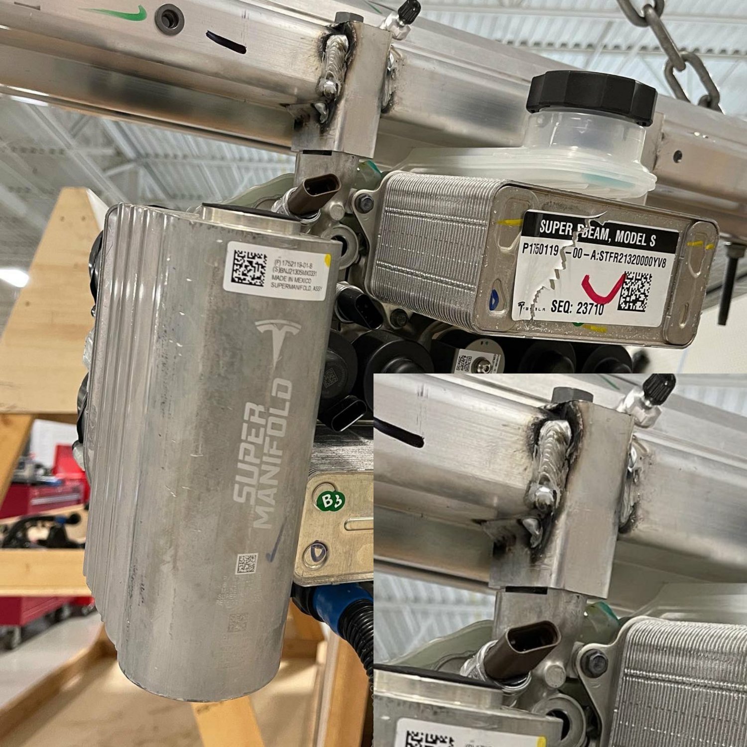
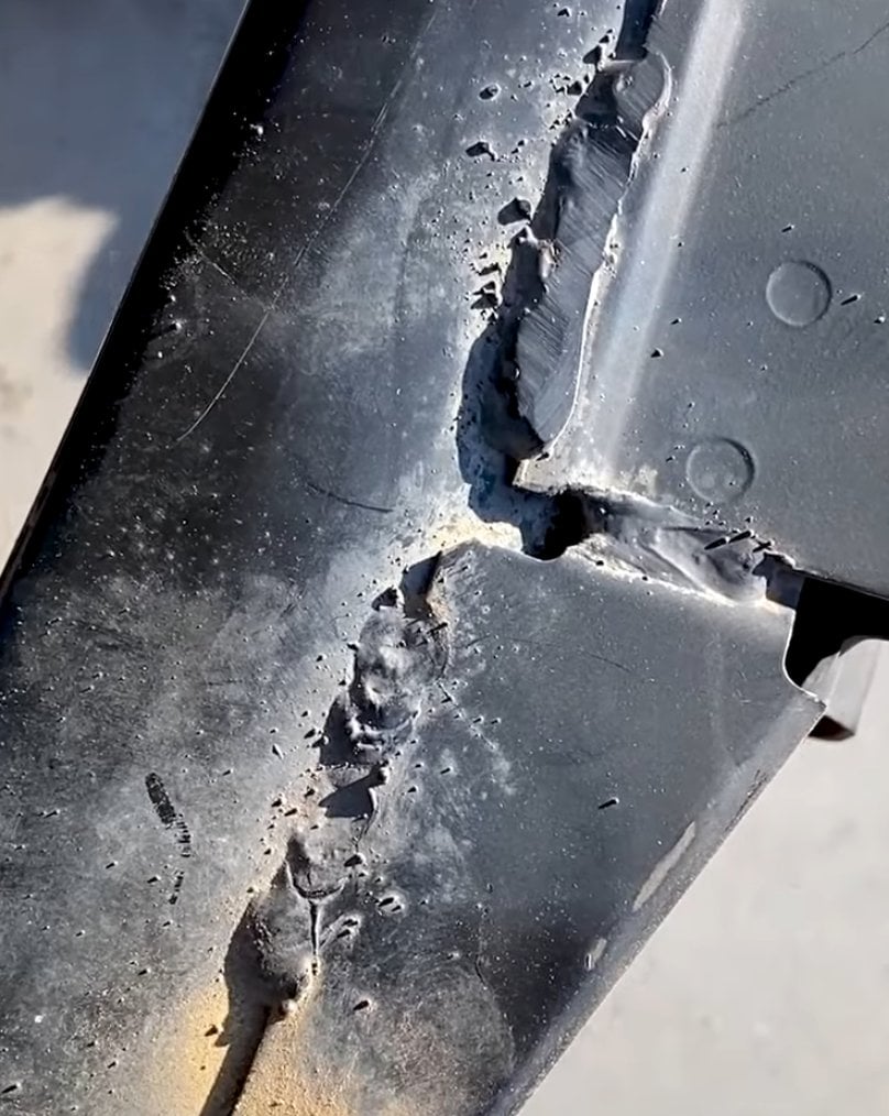

And fit things together this well
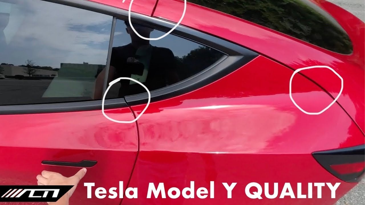
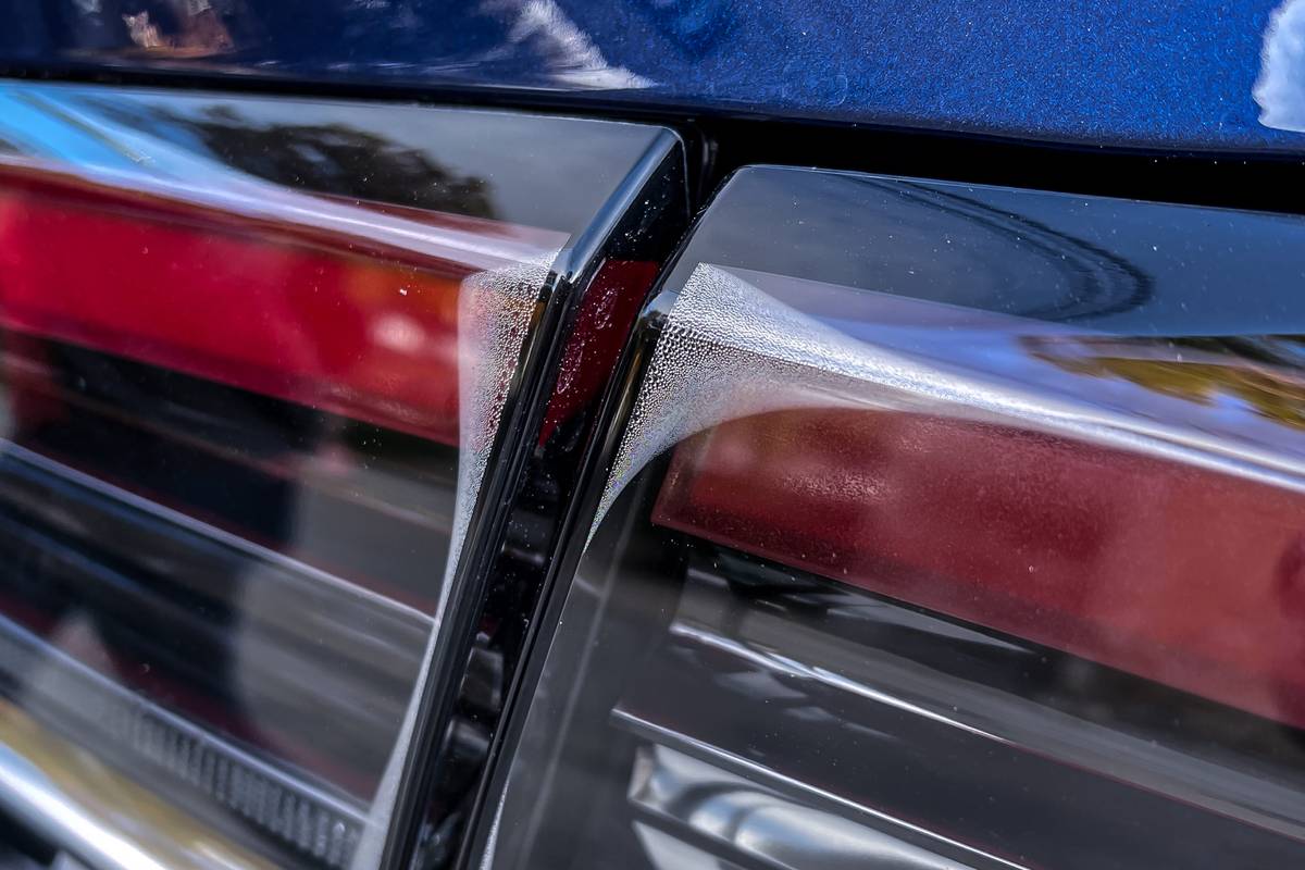
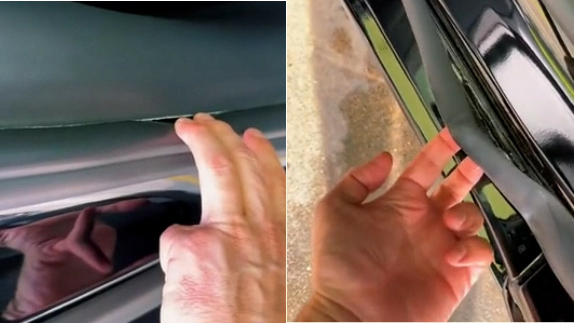
It may be quick and pretty to look at if you don’t inspect it closely, but it has the price tag of a brand new Aston Martin and the build quality of an 80s Yugo.
So, I’ve never owned one, but did a test ride on a con. It was the most plasticy, janky mess I ever sat in. Ok, a Hummer I once sat in was maybe equally bad.
Every surface your hand could touch wasn’t fastened properly and moved in ways it shouldn’t. The door handles wiggled about. The touch screen replacing the middle console - absolute nightmare. The swinging door got stuck halfway.
You could say, all of this is the interior and not the engine. But it’s what the user interacts with. If I can’t trust the manufacturer from my experience with the door handle, I’ll have a hard time trusting them about the brakes.
Blimey, maybe their production quality varies based on which factory it was built in (or Euro NCAP have better quality control regs), the one I’ve been in was lovely!
I don’t know, I’m in Germany


