I would have failed every design class I took in college if I submitted that. Why such wide kerning? Why lower case but upper G? Why so round? Why so completely unreadable at a distance because of micro serifs? There isn’t one good design element in this.
I would have failed every design class I took in college if I submitted that. Why such wide kerning? Why lower case but upper G? Why so round? Why so completely unreadable at a distance because of micro serifs? There isn’t one good design element in this.
It doesn’t say “car” at all either; no elegance or prestige. The old logo was sexy. New one looks like a logo for bottled water or something.
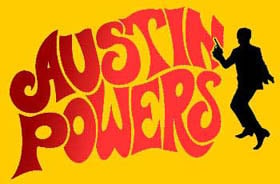
Edit: it’s like going from James Bond to
Austin PowersInspector GadgetAustin Powers has style. Crazy 60s style but style.
